
If you are going to Comment on any specific design, I have numbered them, so you can say which number you are referring to, instead of trying to describe which design you're talking about.
Enjoy!
1.
Design Contest Entry.
The abstract symbols above are supposed to somewhat create a C and a D and you can tell that was the intent if you look at it close enough.
2.
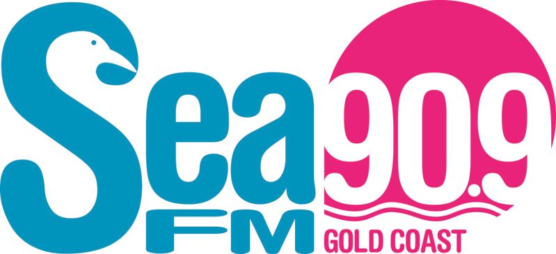
Design Contest Entry
This was for a radio station if you couldn't figure that out, I like this one a lot, I like the colors and I like the seagulls head in the S.
3.
Yeah, I ripped off the new NASA logo concept a little. So sue me.. no wait.. don't
(this also hasn't been used anywhere, just done for fun)
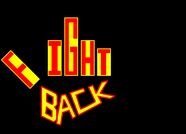
4.
Blah, I don't really want to talk about this one..
5.
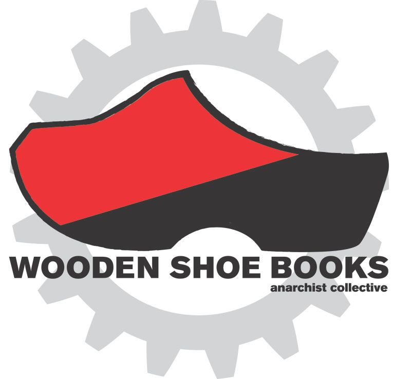
The wooden shoe bookstore. I volunteer at this book store, and I am working on a website for them, which you can see in an earlier post I posted last week if you are interested in seeing it's progress.
6.
My Personal Brand
The V in my last name comes up to create the popped collar for the detective woodcock. The character is a woodcock which is a bird. The reason it is a woodcock, and why I go by woodcock is because it is my family name on my mothers side, and my great grandfather was named Sidney Woodcock and he lived to be 104, and I use it to pay tribute to him and the rest of the family. Plus it's a silly name.. and I'm a silly dude.
7.
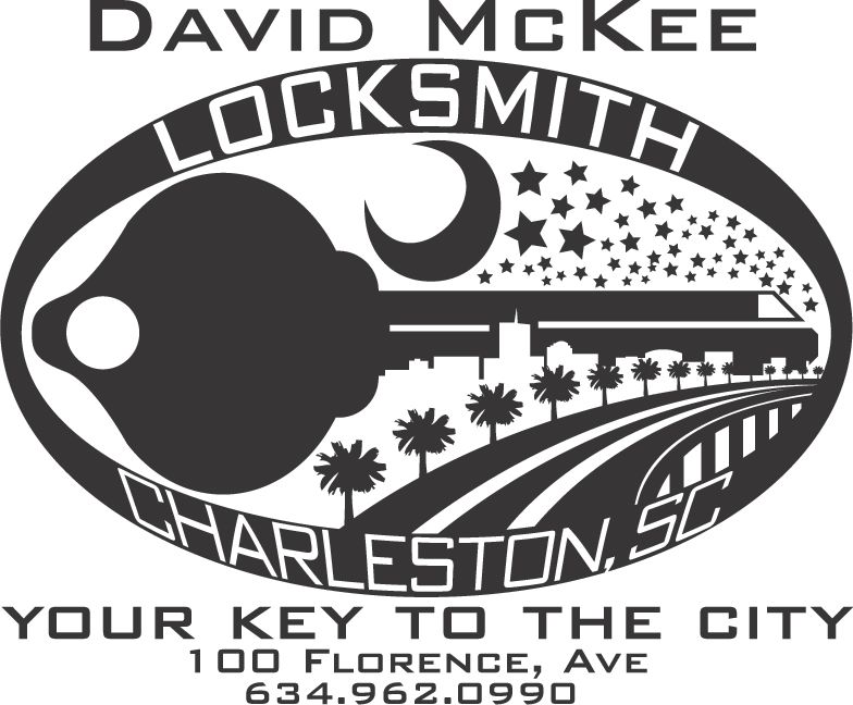
Yeah, I realize there is too much going on in this one.. But I like it because of all the different images that are going on in it. The train, the sky, the skyline, the road, and of course the key. This business doesn't really exist, it was just to build my portfolio.
8.
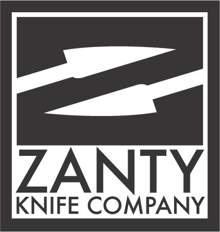
Another project to build my portfolio.
Some people just see the knives in the logo, and some people just see the Z, if you look closely.. I am sure you can see both.
9.
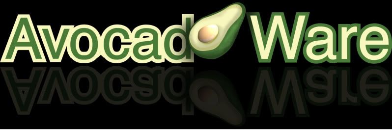
Made this for my uncle. I guess he is creating a software called Avocado Ware. I am aware of the awkwardness between the O and the C, thats because I had to do a makeshift fix, since I originally spelled it with a typo of AVACADO, if he ever plans on using this logo, I will make it look cleaner.
10.
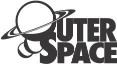
Probably one of my favorite logo's that I have done. It was for a community space in Charleston SC when I lived there called Outer Space (which you probably could have guessed)
11.
Meh.
12.
Meh
13.
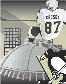
Illustrator illustration of Sidney Crosby and the Igloo (RIP)
Done while I was still in college.. Probably towards the beginning of my education.
14.
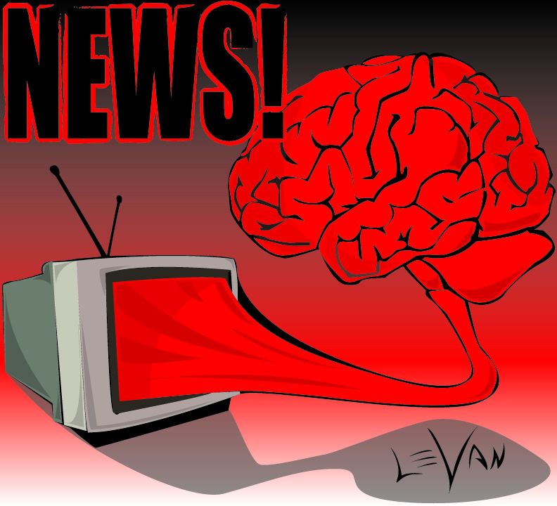
Also done towards the beginning of my education.
This is just a statement that TV Brainwashes you.
The Next designs are done before I went to college and are all done in MS Paint.
Enjoy:
15.
Done in MSpaint before I knew about the wonders of Adobe Illustrator and Photoshop and before my Graphic Design schooling.
16.
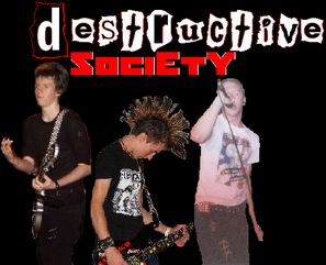
Logo done for my old band, also done in MS Paint.
I think they look good.. for being MS paint.
17.
hahahahaha oh boy. (MS Paint)
18.
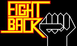
Old band logo.. apparently we were Pogo Punx
19.
LOLOLOL inappropriate
I've already commented on the majority of these, so, I'll keep this short.
ReplyDelete"Blah, I don't really want to talk about this one.."
...enough said, haha.