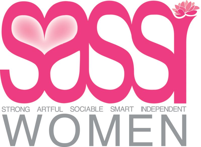
I think the heart made by the S and A is a decent concept, and should be explored more. This iteration of the idea comes off as very gimmicky - what with the heart, the gradient, the pink color, the lotus...it all adds up to be way too much. I also feel that the lettering is very sloppy, the weight of the bowls and the terminals are just very...haphazard, and the subtext below the initials do not align with anything (obviously this is difficult with a word as long as "independent" thrown in at the end, but I feel that there is a better solution).
This is a good start, I feel that it can be pushed to a much more cohesive place though. Simplify it, keep a critical eye and sketch sketch sketch.
I agree about the Heart gradient, I liked it without it, it was more subtle.. But it was requested.
I dont think the lettering is sloppy at all, but I do agree somewhat with the Bowls, however I think they stand out more because of all the attention that your eye is drawn to in the heart gradient.
the subtext it aligned with the edges of the lettering of SASSI, how else would I align it? The only thing that I think looks out of alignment is "women" and that is because of the angle of the 'W' which makes it difficult..
I would like to just remove Women, but I'm not sure if it would be assumed to be a womans group if I did

I don't follow, but I comment...
ReplyDeleteI think the heart made by the S and A is a decent concept, and should be explored more. This iteration of the idea comes off as very gimmicky - what with the heart, the gradient, the pink color, the lotus...it all adds up to be way too much.
I also feel that the lettering is very sloppy, the weight of the bowls and the terminals are just very...haphazard, and the subtext below the initials do not align with anything (obviously this is difficult with a word as long as "independent" thrown in at the end, but I feel that there is a better solution).
This is a good start, I feel that it can be pushed to a much more cohesive place though. Simplify it, keep a critical eye and sketch sketch sketch.
I happen to love it! Of course I want the heart to have a "shadow". And the shadow is perfect.
ReplyDeleteI agree about the Heart gradient, I liked it without it, it was more subtle.. But it was requested.
ReplyDeleteI dont think the lettering is sloppy at all, but I do agree somewhat with the Bowls, however I think they stand out more because of all the attention that your eye is drawn to in the heart gradient.
the subtext it aligned with the edges of the lettering of SASSI, how else would I align it? The only thing that I think looks out of alignment is "women" and that is because of the angle of the 'W' which makes it difficult..
I would like to just remove Women, but I'm not sure if it would be assumed to be a womans group if I did